How can I help?
Following the invasion of Ukraine, many Ukrainian citizens lost healthcare access due to relocation and the destruction of medical facilities in the country. Families with small children, the elderly, and those with chronic conditions or disabilities have been the most affected.
TeleHelp Ukraine is a Stanford medical-student led initiative that's connecting Ukrainian citizens with with physicians across the world. I'm honored to have helped launch this organization by designing its logo.
I created three concepts to pitch to the team at Stanford.
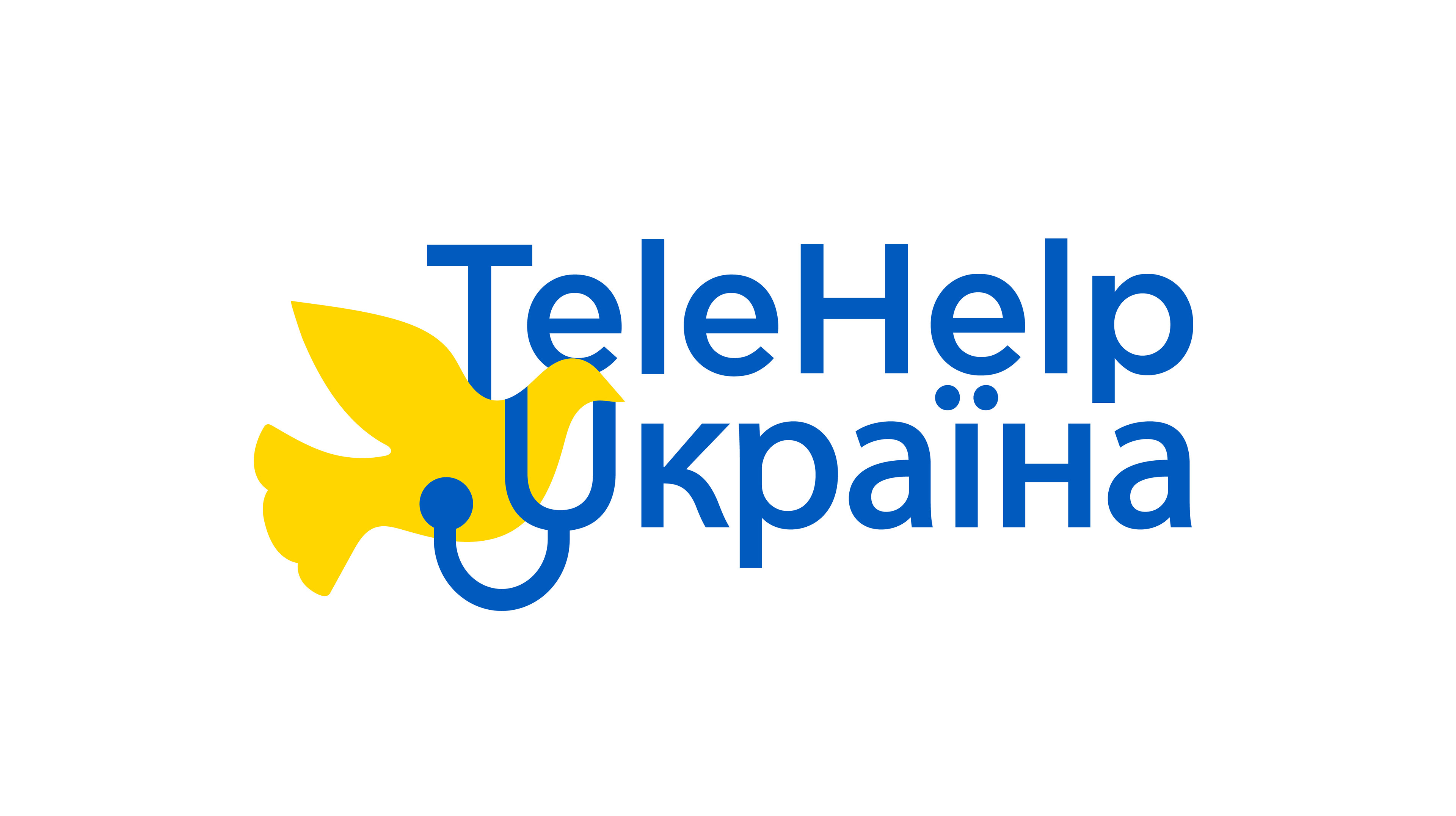
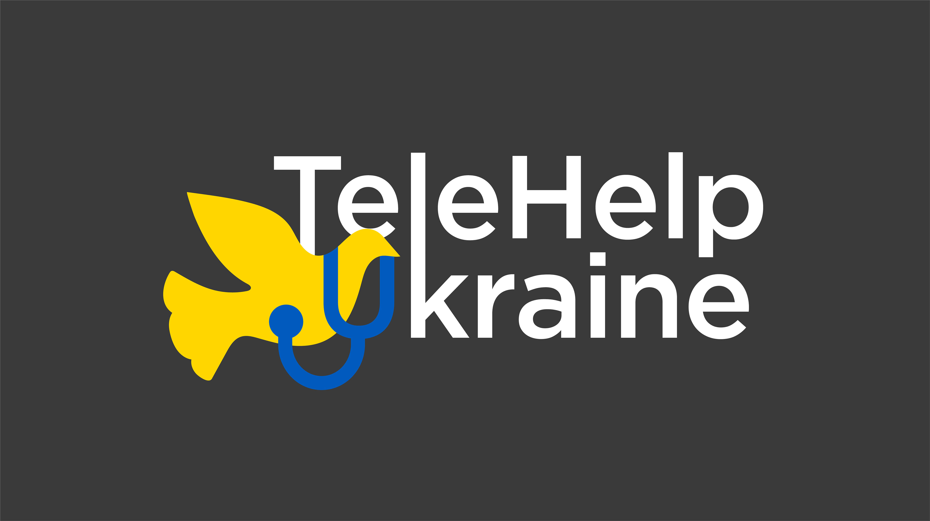
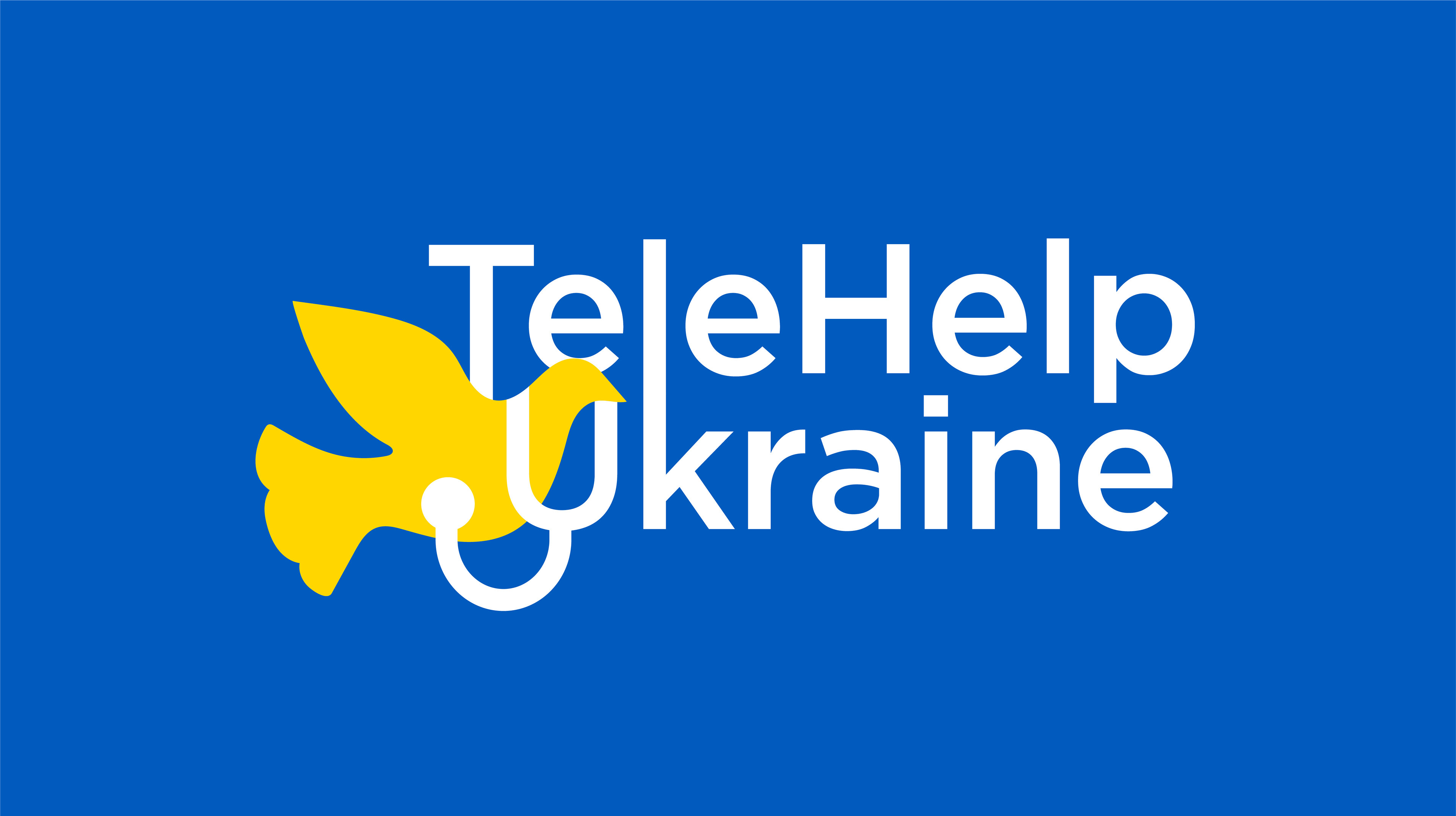
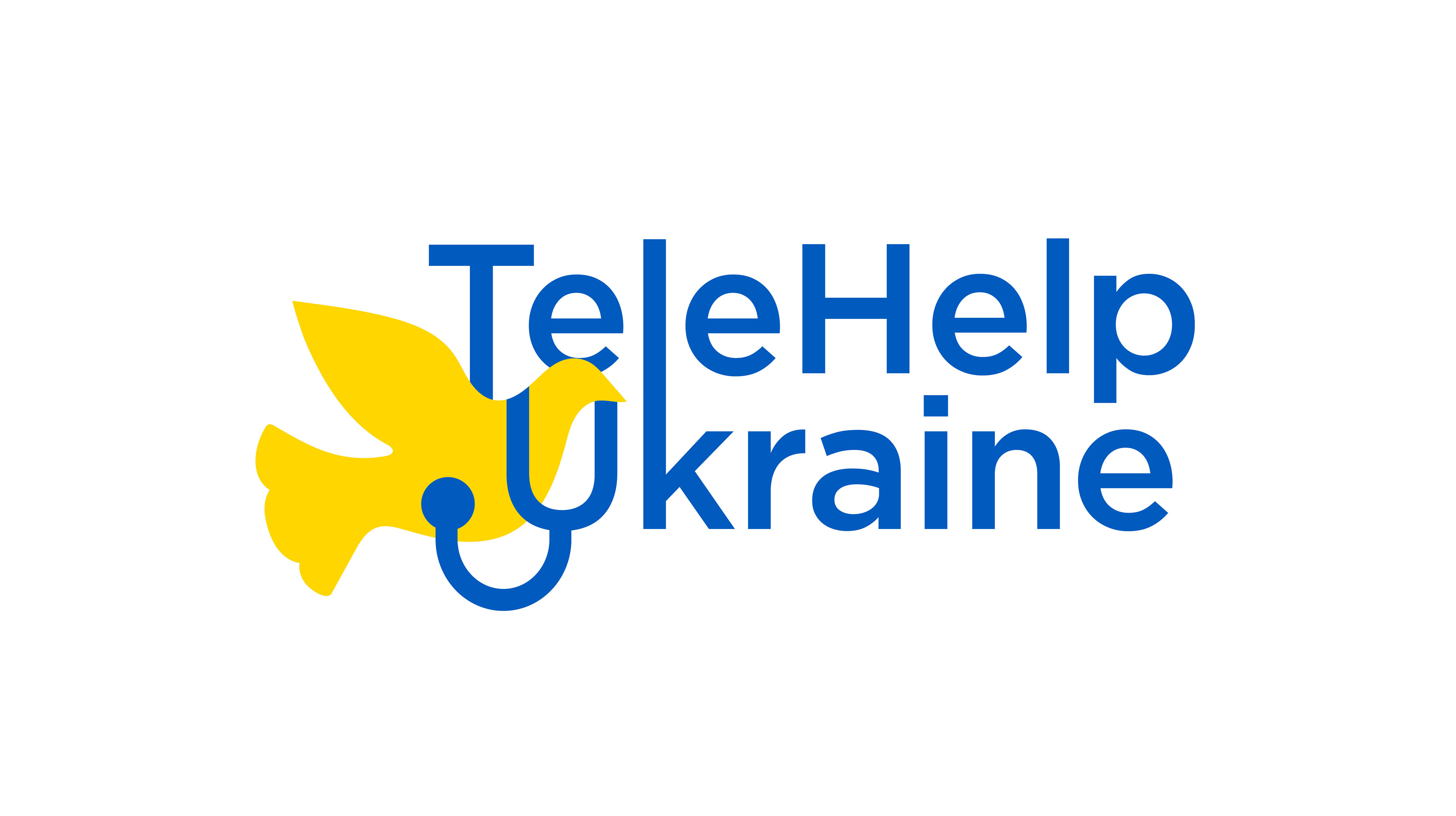
Peace Concept
It can function in two or three colors and communicates the organization's mission of healing and unity in the face of war. The bird and stethoscope image can function as an icon.
Doctor Concept
It communicates a trustworthy organization of trained medical professionals ready to help, and can be used in one color.
Medicine Concept
It works as a full lockup, or can stand alone as an brandmark. It communicates the medical assistance received by patients, complete with a hidden t and u.


The team chose the peace logo, as it most closely aligned with the mission and values of the organization. I have since adapted the logo into a Ukranian version for increased reach to patients that don't speak English.
TeleHelp Ukraine has currently provided over 1,500 appointments to Ukranians in need. To learn more, visit telehelpukraine.com.