Authenticity, adventure, and community.
Top Bunk Bucha is a brand concept developed for a friend's homemade kombucha. She’s passionate about wellness, the outdoors, spontaneity, and her friends. She also sleeps in a bunk bed, hence the name.
This piece won 3rd Place and Judge's Choice in Visual Identity and Branding in AEJMC’s Best of Design contest, as well as an Honorable Mention in Graphis New Talent Annual 2022.
Top notch type.
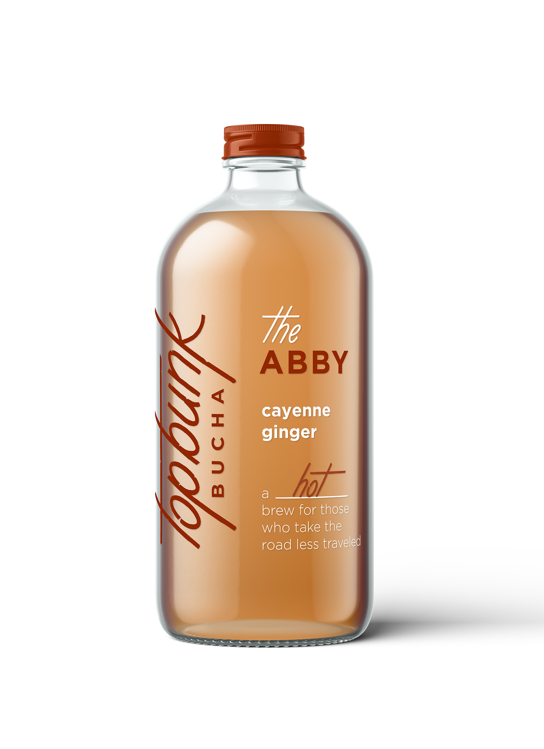
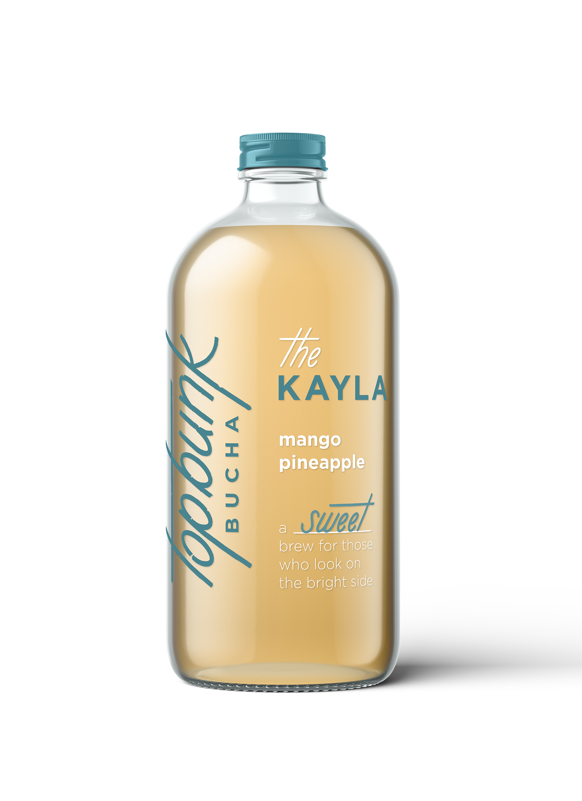
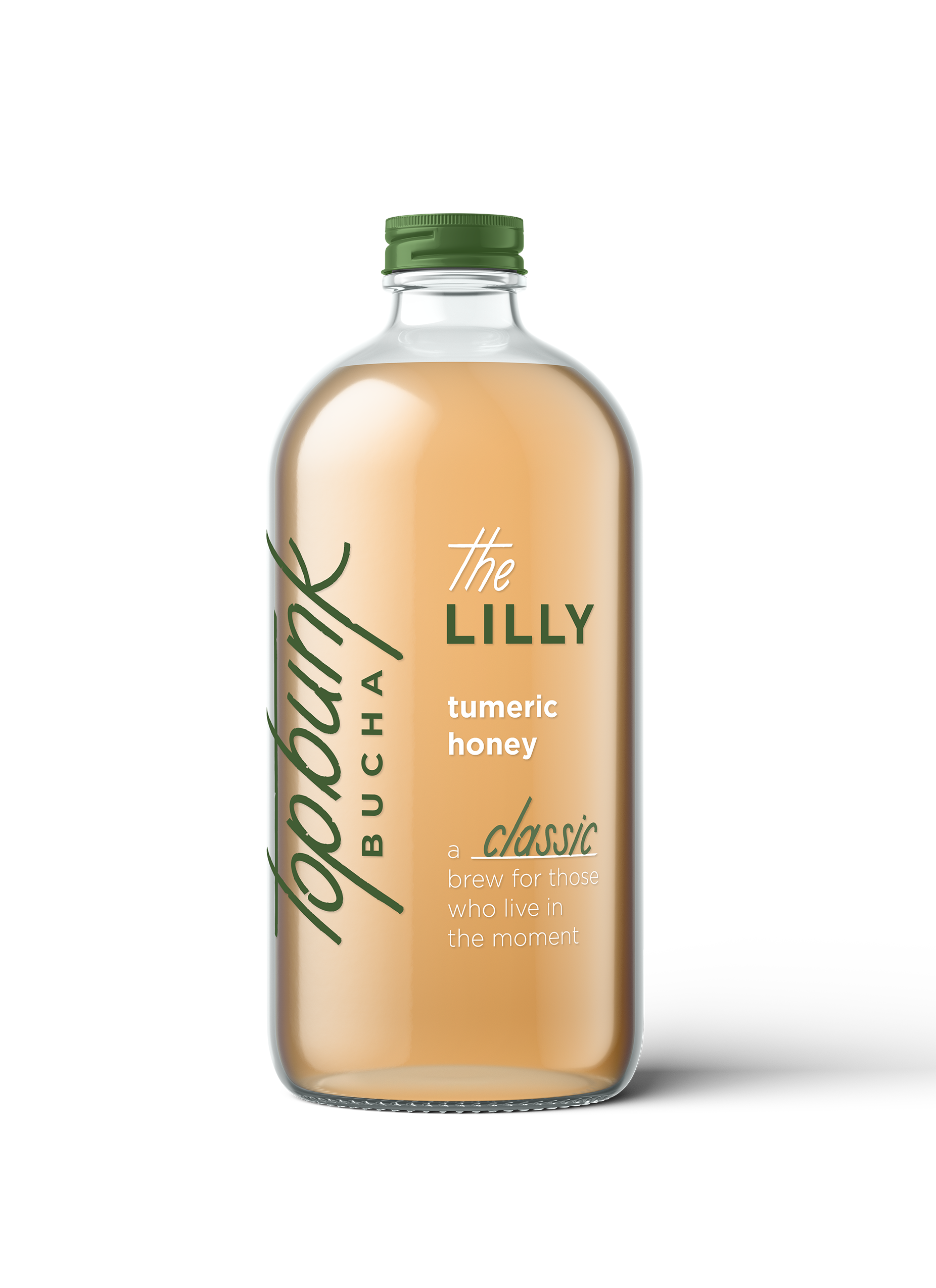
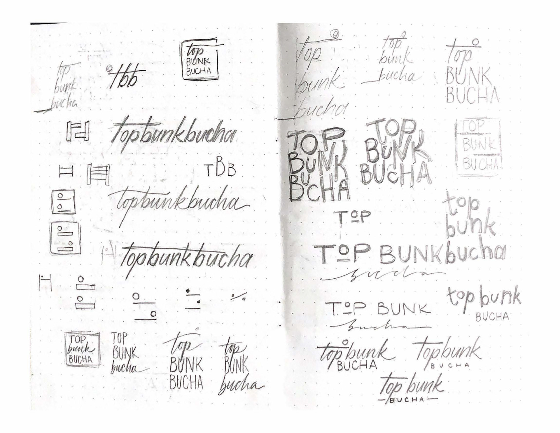
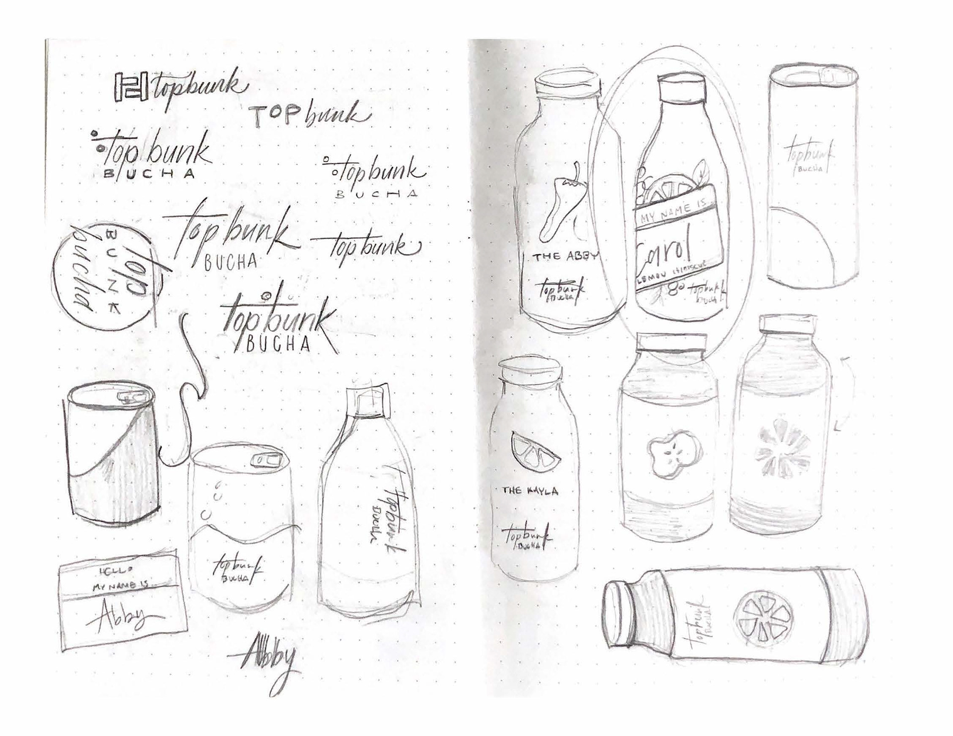
The custom logotype I created is textured and angular, reminiscent of surf shops and something you’d find carved into a tree— or a bunk bed.
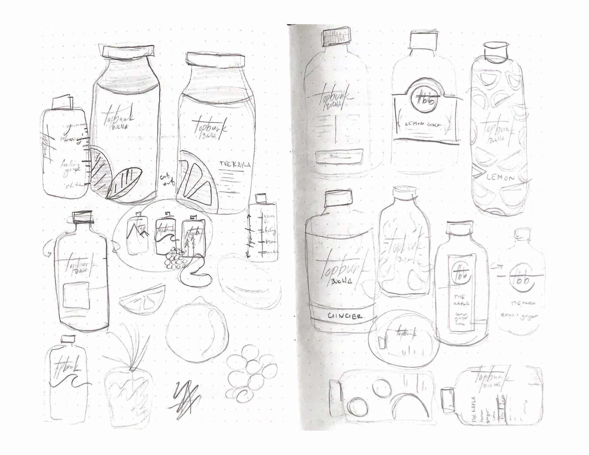
The names and descriptions of the flavors show that this kombucha is made by real people, for real people. The minimal screen-printed style of the labels suggest a simple and slightly trendy product with nothing to hide, while earth-tone accent colors complement the amber beverage and communicate natural ingredients.
